How We Added Forecasting to VictoriaMetrics Dashboards to Predict Cluster Failures
Surfacing trends, outliers, and future risk before they become incidents
Constraints of Conventional Real Time Monitoring
For a long time, we looked at our Pulse dashboards the same way most engineers look at a car's speedometer. It told us how fast we were going right now, and nothing about the road ahead. Our VictoriaMetrics powered dashboards gave teams a genuinely clear picture of heap usage, CPU, job counts, and every other vital sign a Hadoop cluster produces. But there was a question none of those charts could answer on their own: when does a normal wobble in a metric turn into something worth losing sleep over.
Every team we spoke with had their own answer, and none of the answers scaled. Someone would eyeball a graph they had stared at for years and just know something felt off. Someone else would write a one off script to flag a threshold breach, use it for a quarter, and quietly forget about it. It worked, until it didn't, and by the time it didn't work the incident was already underway. That gap between "the data already shows a problem" and "a human finally notices" is where most of our worst outages were born, and it is exactly the gap we set out to close.
An Overview of the Anomaly Detection and Forecasting Feature
We did not want to build a separate anomaly dashboard that people would have to remember to open. Pulse dashboards are something teams already live in every day, so the feature needed to live there too. What we shipped is anomaly detection for the time series metrics already rendered on our Dashplots template, specifically the line and area charts teams check most often. Flip a toggle, and the same chart that showed you CPU usage a moment ago now shows you where that usage strayed from what the model expected.
Alongside detection, we built forecasting. Rather than only telling you what already happened, Pulse now predicts where a metric is headed using models trained on its own history, and that forecast feeds directly into our alerting service. If the model sees a deviation coming, it can raise a flag before the deviation actually arrives. That single shift, from reactive to anticipatory, is really the heart of everything else in this post, and it shapes every design decision described below.

That diagram is a simplified version of the full picture, but it captures the two paths every metric takes once it leaves VictoriaMetrics: one path trains a model and looks forward, the other watches the present moment and flags what does not belong. Both paths land back on the same dashboard the team already trusts, which brings us to why that mattered so much in practice.
The Operational Benefits of Predictive Monitoring
The most immediate benefit is speed. Instead of relying purely on static alert thresholds or a tired engineer scrolling through a wall of graphs, anyone can flip on the anomaly view and instantly see what is unusual. What used to take a careful, patient read of a chart now takes a glance, and that glance often happens minutes into an issue rather than hours into one.
Forecasting adds a second, quieter benefit that took us longer to appreciate: it turns capacity planning from guesswork into a conversation with data. Teams can see how memory usage or job load is likely to trend over the coming days and scale, tune, or reschedule accordingly, well before anything actually breaks. Instead of provisioning capacity after a painful incident teaches everyone a lesson, the lesson arrives as a forecast line on a familiar chart.
There is also a benefit that is harder to quantify but just as real, which is how this changes conversations with stakeholders. When we can point at a chart and say "here is the trend if we leave it alone" next to another line that says "here is what we did instead," the story tells itself. Proof of value stops being a slide deck and starts being a chart people already trust. That trust, though, only holds up if the modeling underneath it is sound, which is where the real engineering challenge began.
Addressing the Challenge of Cardinality in Model Design
Here is something that surprised our team early on. A single forecasting model per metric sounds simple until you realize a cluster might have a NameNode or two, but hundreds of DataNodes or NodeManagers. Training and maintaining a dedicated forecast model for every single one of those hundreds of nodes would have been both computationally expensive and, frankly, noisy in ways that made the output less trustworthy rather than more.
So we split the approach in two, based on how many instances of a given entity type exist in a cluster.
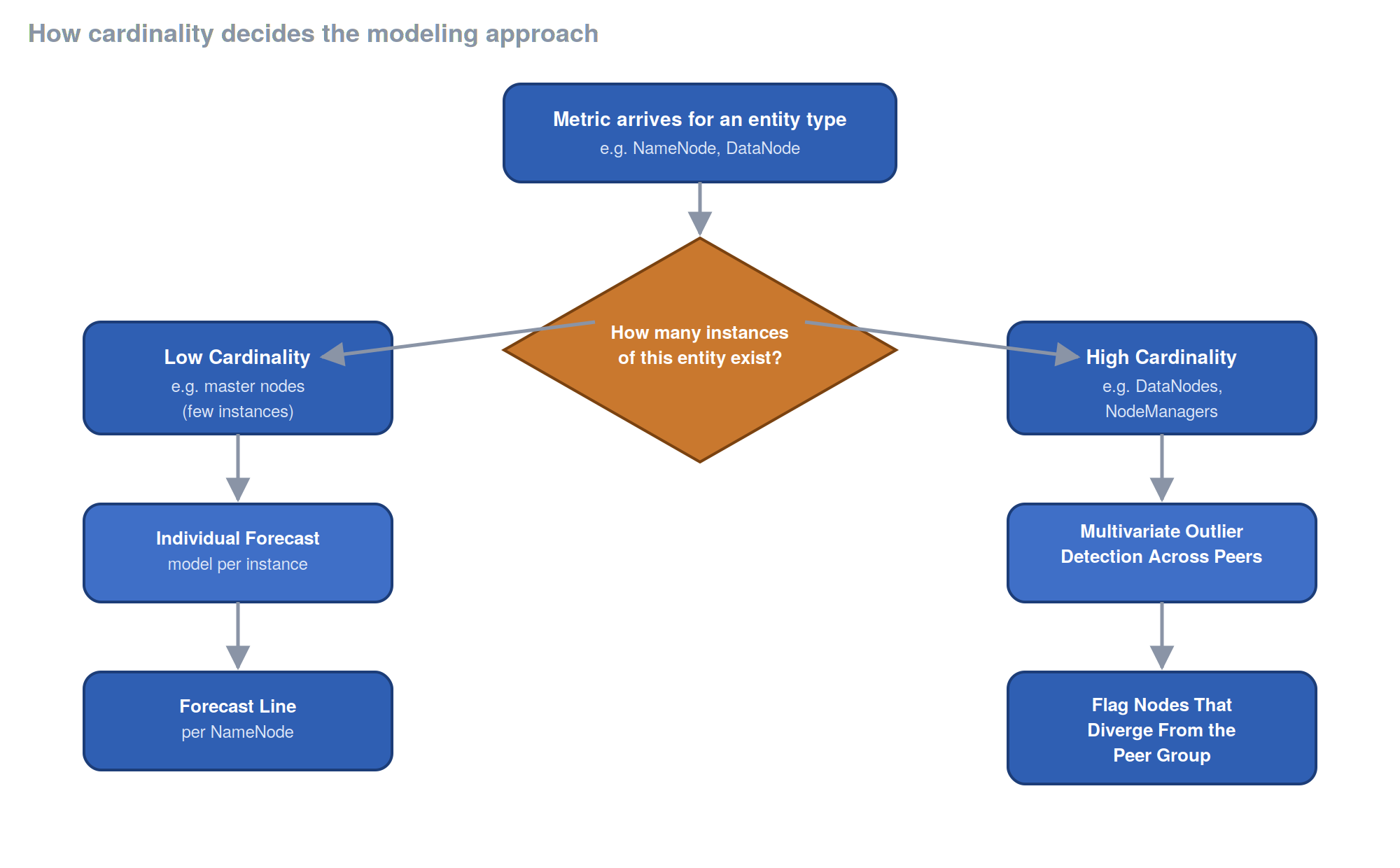
For low cardinality entities like master nodes, we build an individual forecasting model per instance, so a NameNode gets its own forecast line built from its own history. For high cardinality entities, we compare peers against each other instead, running multivariate outlier detection to flag the node whose behavior has drifted away from the rest of the pack. A single DataNode climbing while ninety nine others stay flat is a far more useful signal than ninety nine noisy, low confidence forecasts competing for attention. That decision, more than any other, shaped how the rest of the system was built, and it led us straight into a second, less obvious problem.
Managing Model Drift Through Scheduled Retraining
Models are not something you train once and walk away from. Cluster behavior evolves as workloads change, as new jobs get scheduled, as data grows, and a model trained on last month's patterns slowly becomes less useful without anyone noticing. We built retraining on configurable, trigger based intervals so the models stay close to current reality rather than describing a cluster that no longer exists.
Getting the sensitivity right took real trial and error. Too eager, and the dashboard fills with false positives until people start tuning the feature out entirely, which defeats the whole point. Too conservative, and the real issue slips through exactly when it matters most. We calibrated thresholds carefully and gave teams the ability to override sensitivity per metric, because a heap usage spike on one service can mean something completely different than the same shape of spike on another.
We also made a deliberate choice not to force anyone into a new interface. Teams already rely on Pulse dashboards daily, and any redesign that asked them to relearn their workflow would have slowed adoption to a crawl. Overlaying anomaly markers and forecast bands directly onto the charts people already check meant the learning curve was close to zero, and every feature we shipped stayed behind a license gate so it reaches the customers who have opted into it without disrupting anyone else. All of that groundwork is really only worth talking about because of what it produced once real teams started using it.
Early Results From Production Deployment
The clearest win so far has been time to detect. Memory leaks and abnormal heap usage spikes that used to take hours or days of digging now surface in the dashboard almost as soon as they start, simply because the anomaly marker is sitting right there on the chart someone is already looking at.
Capacity planning has shifted from reactive to anticipated. Teams tell us they are scaling ahead of heavy workloads instead of discovering the shortfall mid incident, and some are using the forecast to preemptively throttle or reschedule jobs before resource usage becomes a genuine problem. On call and SRE workloads have gotten lighter too, with fewer of those frustrating "unknown unknown" incidents that used to eat an entire afternoon of investigation. None of that happens automatically though, so it is worth walking through exactly how a team gets there.
A Step by Step Guide to Enabling the Feature

The rollout itself is intentionally light. A team turns the feature on through the license toggle, checks the global defaults for training window and trigger interval on the settings page, and adjusts them per service if the defaults do not fit. From there, anomaly and forecast overlays get enabled on the dashboards that already carry the metrics we support, and flagged anomalies become part of the standard diagnostic routine rather than an afterthought bolted onto existing runbooks.
That last step, feeding feedback back into threshold tuning, is the one we care about most, because this is not a feature we consider finished. As more teams put it through its paces, edge cases will surface that our early testing never touched, and alert sensitivity, retraining cadence, and overall clarity will keep evolving in response.
Conclusion and Next Steps
What started as a frustration with static dashboards has turned into something closer to a shift in how we think about monitoring altogether. We moved from "here is what is happening right now" to "here is what is likely to happen, and here is time to do something about it." That is a genuinely different relationship with your own infrastructure, and once a team experiences it, going back to plain real time charts feels like driving with your eyes fixed only on the rearview mirror.
There is plenty still to refine, from sensitivity tuning to expanding the set of supported metrics, and we would rather hear about the gaps directly from the teams living with this every day than guess at them ourselves. If you are running Pulse and curious about turning this on, or you have thoughts on what should be flagged differently, we would genuinely like to hear it.
This piece is part of an ongoing series where we unpack the lessons behind building and growing our data infrastructure. If you're after more posts like this, check out the full collection at engineering.acceldata.io.